Overview
A pasta branding project was developed for a client aiming to launch their business on a limited budget. The project focused on crafting a strong, memorable logo and essential branding materials, ensuring clear communication and visual appeal while maintaining cost efficiency to support the business’s successful kickstart.
Role
Art Direction, Logo Design
2024
Client
Pasta brand under 3 Embers

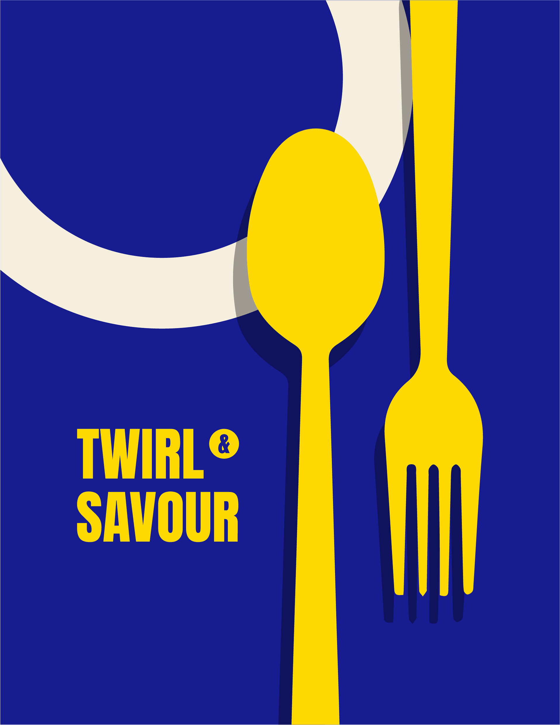
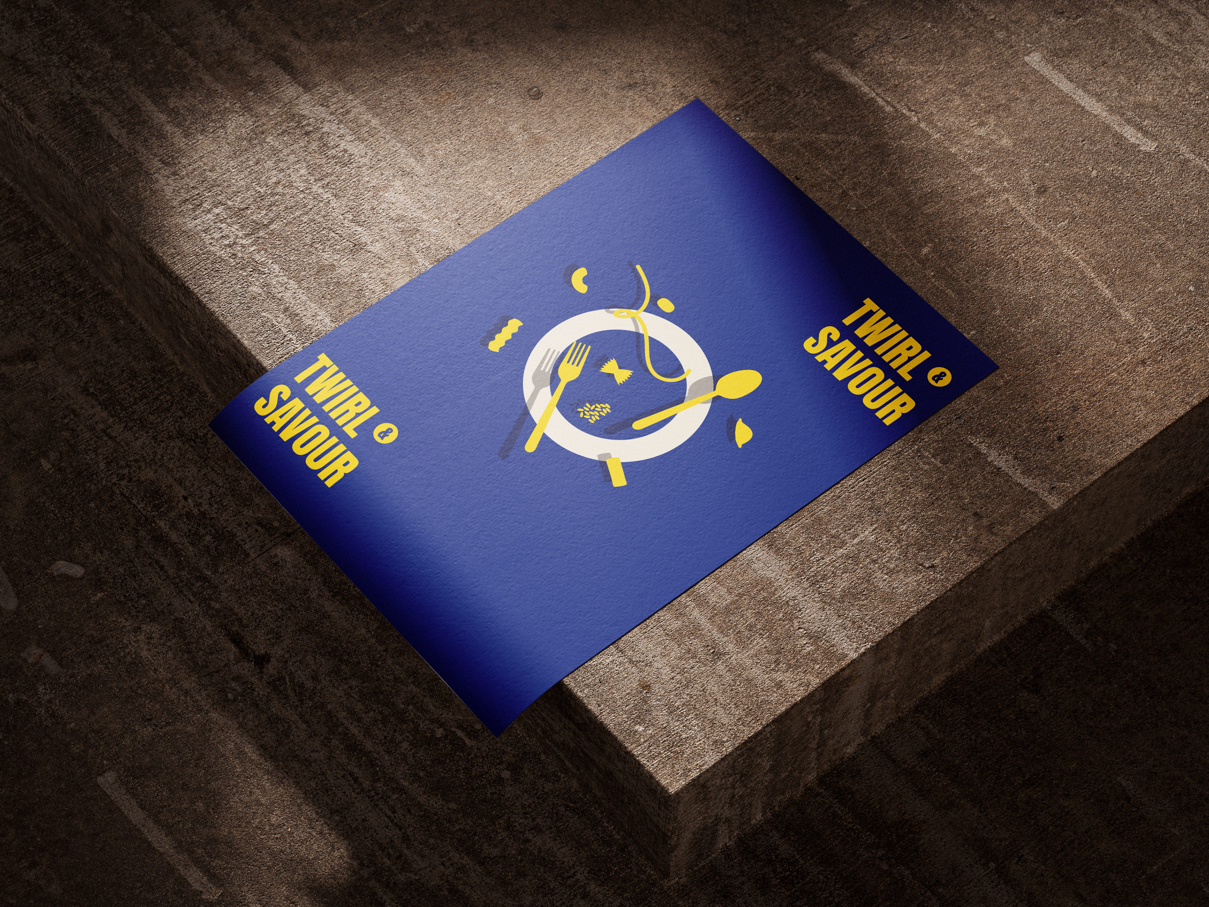
"The harmonious pairing of blue and yellow embodies the enchanting Italian aesthetic that’s sure to steal your heart."
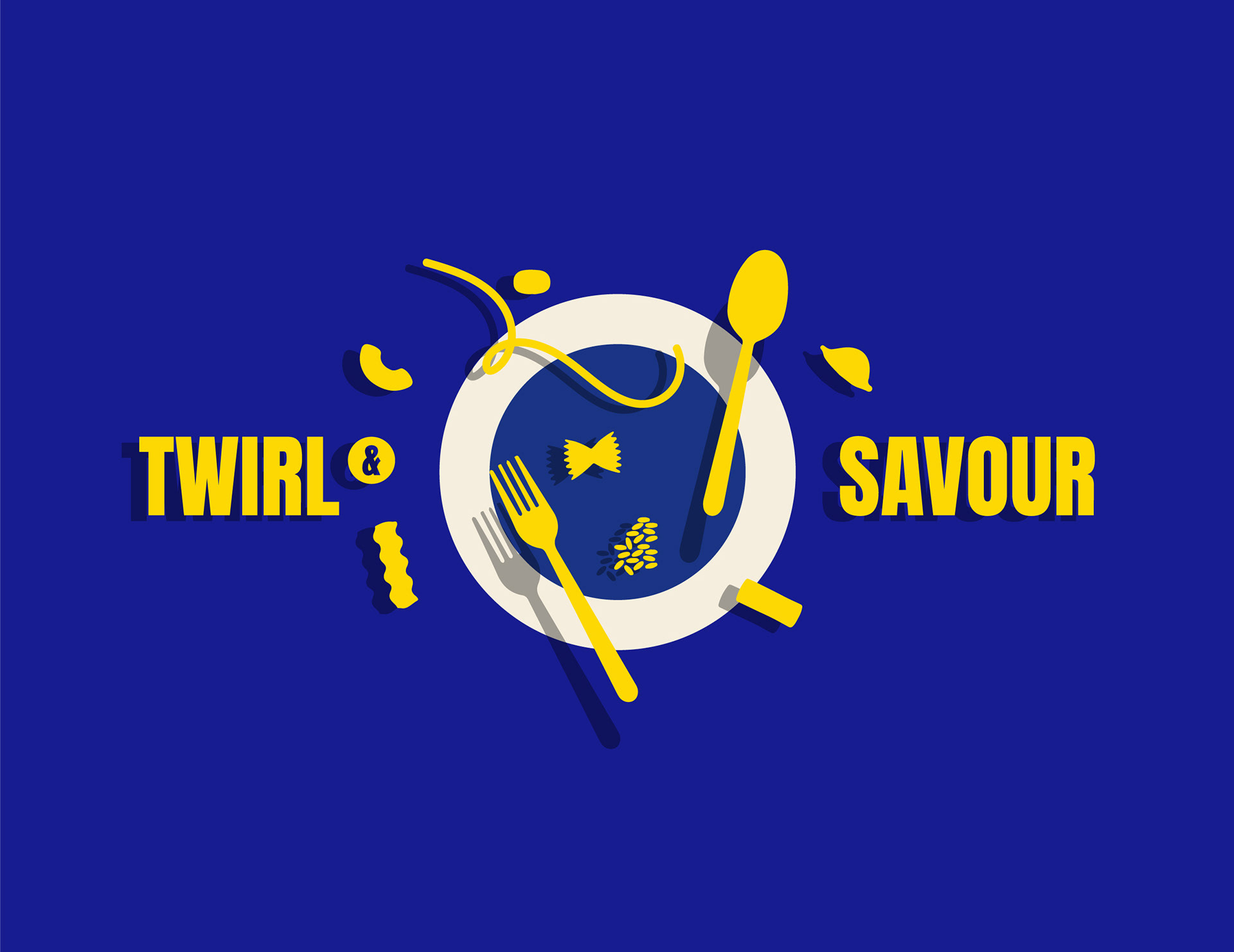
The branding design is thoughtfully crafted to capture the essence of Italy, evoking vivid imagery of breathtaking landscapes, quaint villages, and the warmth of the Mediterranean sun.
It reflects the soul of Italy, blending its natural beauty, cultural richness, and welcoming spirit into a visual experience. Each element is designed to transport viewers to the heart of this captivating land, leaving a lasting impression of its timeless charm and allure.
The use of illustration aims to translate the brand values of
Twirl & Savour from words into visuals. The designs are carefully crafted to reflect the essence of the brand and convey its message clearly to the audience.
Twirl & Savour from words into visuals. The designs are carefully crafted to reflect the essence of the brand and convey its message clearly to the audience.
Geometric patterns are a timeless trend, and it’s always exciting to blend different shapes, lines, and curves to create a unique and engaging result.
“Branding that speaks directly to the heart —simple, clear, and unforgettable.”
Thank you for reading!
Interested in hiring me? Enquire at mail@angelalsn.com
Interested in hiring me? Enquire at mail@angelalsn.com